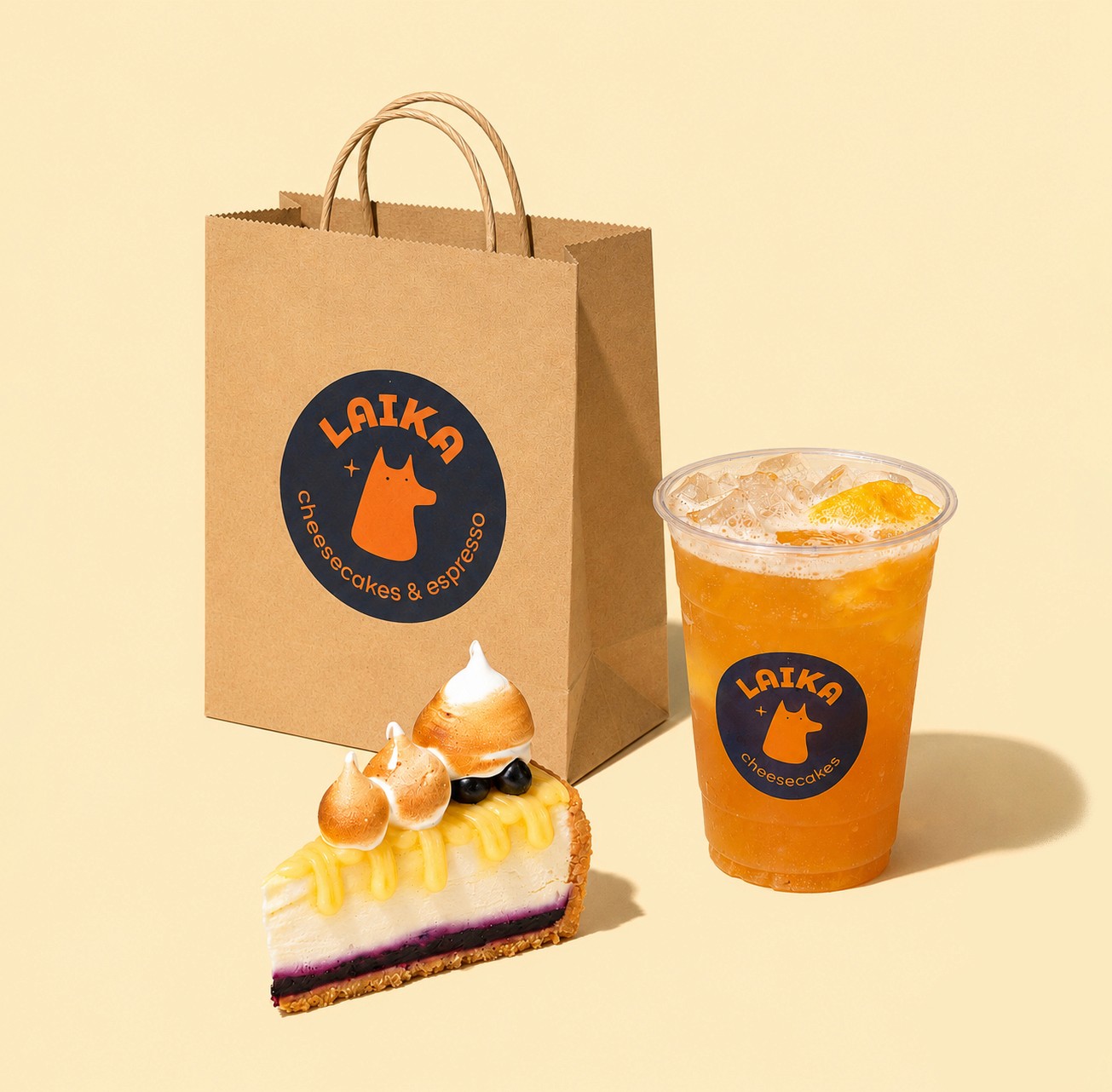


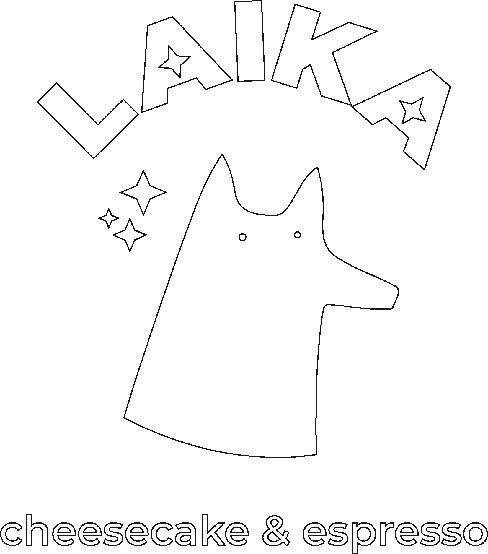
For the logo, we removed extra details that created visual noise, switched to a vintage-inspired typeface, and made the colors more contrasty. We also softened its features, and made the dog look more friendly and recognizable.
For the box, we used a macro photo of the cheesecake bar cross-section – delicious-looking image gave an idea of what’s inside and stands out on the shelf. A large-scale embossed logo with a gloss finish emphasizes the product’s premium positioning. A color-coded system helps customers differentiate between flavors.
The visual direction was inspired by the nostalgic character, conveyed through a slightly muted palette of bright colors and a creamy background.
PROCESS
Laika is a Texas-based dessert and coffee brand specializing in gourmet cheesecakes. The project included a logo refresh and the development of retail packaging for a new cheesecake bar product.
ABOUT


old logo
new logo
The old logo looked outdated and didn’t match brand’s nostalgic personality. Laika is a dog in space, but customers would often confuse it with other animals.
The bakery also introduced a new cheesecake bar that was intended for distribution in local stores. We needed to design a retail box that looks appetizing, reflect the quality of the product, and create a clear system for differentiating flavors in-store.
Challenge
PACKAGING
Laika cheesecakes
CLIENT PROJECT

LOGO REFRESH
Our initial concept focused on showcasing the product through detailed photography that covered the entire box. While it looked appetizing, it didn’t reflect Laika’s personality or stand out in the frozen section. The text also wasn’t easy to read.
After completing the original packaging, the client introduced a new four-pack. I created a completely new box design to fit the new format while keeping the brand recognizable.
Refining the Concept

The old logo looked outdated and didn’t match brand’s nostalgic personality. Laika is a dog in space, but customers would often confuse it with other animals.
The bakery also introduced a new cheesecake bar that was intended for distribution in local stores. We needed to design a retail box that looks appetizing, reflect the quality of the product, and create a clear system for differentiating flavors in-store.
Challenge

old logo
new logo
Laika is a Texas-based dessert and coffee brand specializing in gourmet cheesecakes. The project included a logo refresh and the development of retail packaging for a new cheesecake bar product.
ABOUT


PACKAGING
Laika cheesecakes
CLIENT PROJECT
LOGO REFRESH
polina.pavlinina@gmail.com
For the logo, we removed extra details that created visual noise, switched to a vintage-inspired typeface, and made the colors more contrasty. We also softened its features, and made the dog look more friendly and recognizable.
For the box, we used a macro photo of the cheesecake bar cross-section – delicious-looking image gave an idea of what’s inside and stands out on the shelf. A large-scale embossed logo with a gloss finish emphasizes the product’s premium positioning. A color-coded system helps customers differentiate between flavors.
The visual direction was inspired by the nostalgic character, conveyed through a slightly muted palette of bright colors and a creamy background.
PROCESS

Refining the Concept
Our initial concept focused on showcasing the product through detailed photography that covered the entire box. While it looked appetizing, it didn’t reflect Laika’s personality or stand out in the frozen section. The text also wasn’t easy to read.
After completing the original packaging, the client introduced a new four-pack. I created a completely new box design to fit the new format while keeping the brand recognizable.
