ROCCO'S

concept
brand identity
loyalty card





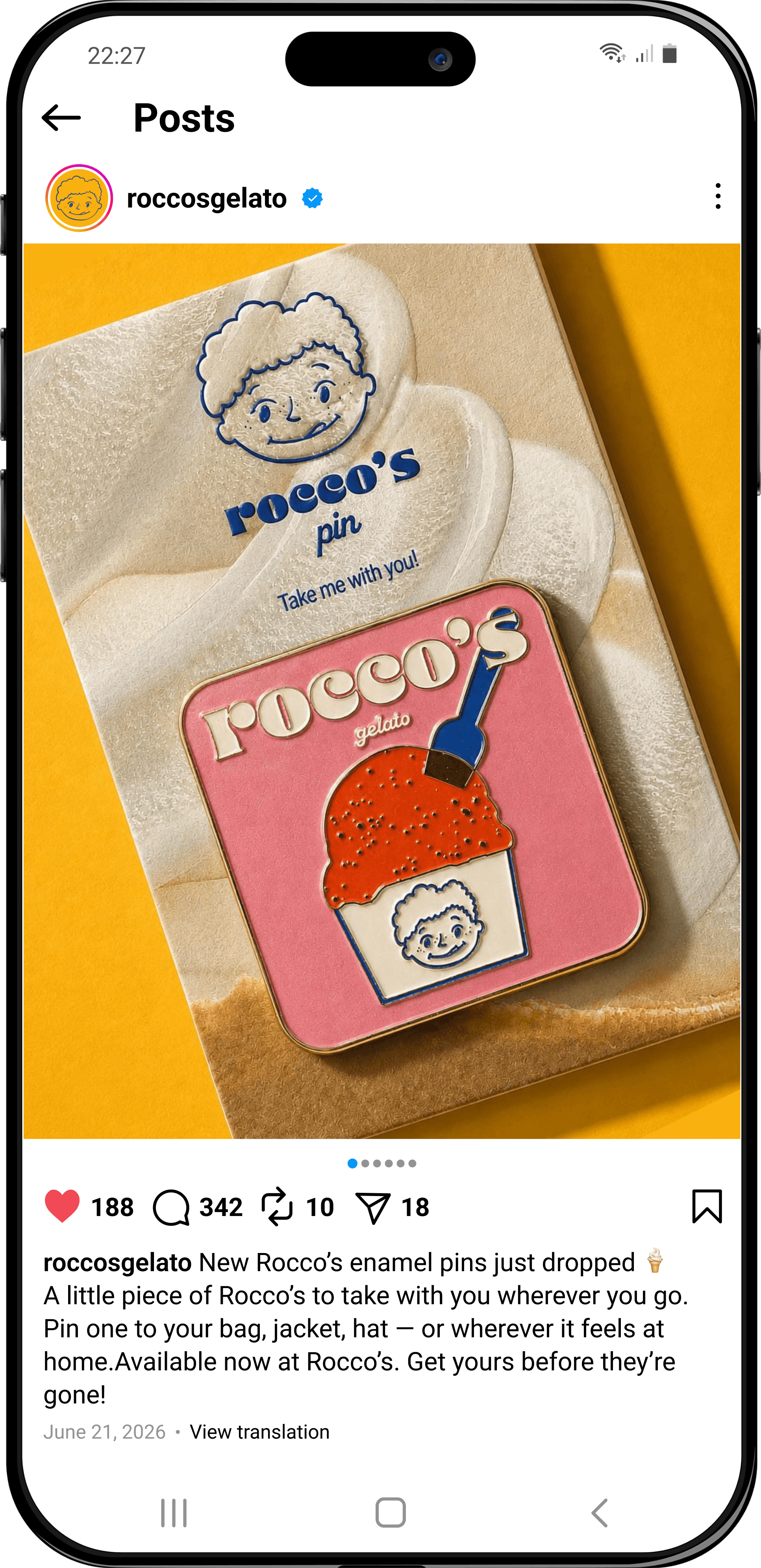
We decided not to rely on the usual symbols associated with Italy, such as Vespas, the Italian flag, or the Colosseum. Instead, while developing a playful graphic language, we looked at the traditional harlequin diamond pattern found in Italian carnival imagery and noticed its resemblance to the pattern of a waffle cone. We turned it into one of the brand’s main graphic elements and added a risograph-inspired print texture to give it a vintage feel. For the logo, we drew Rocco with a playful expression, licking his lips, and paired him with a bold typeface inspired by vintage Italian advertising. A bright, contrasting color palette brings a sense of joy and playfulness to the identity. The system was then applied across merchandise and brand accessories, as well as a retail packaging line with different gelato flavors.
PROCESS
The goal was to create a cheerful, nostalgic identity that feels familiar without looking dated. The visual direction needed to capture the character of a family gelato shop and apply it across packaging, signage, loyalty cards, merchandise, and retail products.
Challenge
Rocco’s is a family gelato brand inspired by the feeling of long, carefree summer days and old Italian gelaterias. It combines traditional homemade gelato with a modern twist and a playful visual world centered around Rocco – a fictional character created as the face of the family brand.
ABOUT


We decided not to rely on the usual symbols associated with Italy, such as Vespas, the Italian flag, or the Colosseum. Instead, while developing a playful graphic language, we looked at the traditional harlequin diamond pattern found in Italian carnival imagery and noticed its resemblance to the pattern of a waffle cone. We turned it into one of the brand’s main graphic elements and added a risograph-inspired print texture to give it a vintage feel. For the logo, we drew Rocco with a playful expression, licking his lips, and paired him with a bold typeface inspired by vintage Italian advertising. A bright, contrasting color palette brings a sense of joy and playfulness to the identity. The system was then applied across merchandise and brand accessories, as well as a retail packaging line with different gelato flavors.
PROCESS
Rocco’s is a family gelato brand inspired by the feeling of long, carefree summer days and old Italian gelaterias. It combines traditional homemade gelato with a modern twist and a playful visual world centered around Rocco – a fictional character created as the face of the family brand.
ABOUT
The goal was to create a cheerful, nostalgic identity that feels familiar without looking dated. The visual direction needed to capture the character of a family gelato shop and apply it across packaging, signage, loyalty cards, merchandise, and retail products.
Challenge

ROCCO'S
concept
brand identity
loyalty card